
Web design trends are always exciting to follow. Every year, web designers find new ways to create interesting, attractive, and engaging websites for various businesses and individuals. The technology behind web design and development is also evolving, giving designers more tools and freedom in making their visions a reality.
The trends brewing in 2018 are no less exciting. There are some interesting new approaches as well as improved design languages taking the centre stage and creating headlines. We are going to take a look at the top 7 web design trends in 2018 in this article.
Organic Shapes
While boxy layouts, cards, and straight lines were very popular thanks to the minimalistic web design theme, designers are starting to incorporate more organic shapes, curves, and circles into the web designs of 2018. This trend can be seen in everything from primary elements – such as form fields – to the grand design of a website.
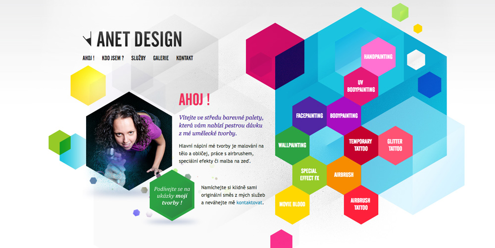
We’re also seeing the comeback of diagonal lines and unconventional square angles. You only need to see Stripe’s new site to understand how simple lines can alter the look and feel of an entire site substantially.
Bold Animations
We saw designers shying away from extravagant animations and page transitions in 2017. Once again, minimalist design was the theme of the year, and bold animations weren’t really suitable for minimalistic sites. This year, however, expect to see bolder and more elaborate animations making sites more attractive.

There are things to consider when adding animations to a page. It is still important to avoid disrupting the natural scroll of the page and ruining the user experience in general, but designers can be more experimental with the way they incorporate CSS and HTML5 animations to pages.
Serif Fonts
2018 is also the year of Serif fonts. Serif fonts are considered more readable than Sans-serif alternatives, which is why more sites are using Serif fonts when displaying long articles and highlighting key web elements.
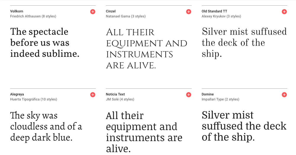
IBM Plex Serif offers a nice balance between clean lines, good readability, and nice font design. It is a web-safe font available through Google Fonts and it is one that many sites now use for bold titles and long texts. Roboto Slab remains as many designers’ favourite, but don’t ignore beautiful fonts like Playfair Display and Cormorant Garamond.
Polished Web Videos
Aside from animations, designers are also turning to web videos as a way to add movement to the sites they design. Better video compression and integration with HTML5 enable the use of web videos in more complex situations.
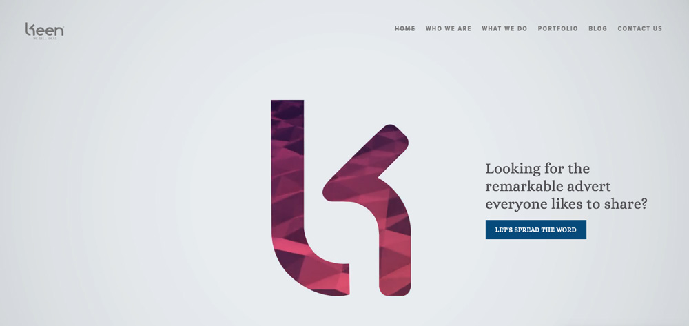
Web design companies like Keen are no stranger to using videos for design and branding purposes. In the case of Keen, the company’s site actually incorporates video in a unique and interesting way. A video background displaying Keen’s logo blends seamlessly with the rest of the site.
High resolution videos are also in right now. Once again, the improved compression technology means videos can be as sharp and vivid as vector images and photos without slowing down the site substantially.
Custom Illustration
Speaking of vector images, we are now seeing more sites using custom illustrations rather than photos. Illustrations are considered more attractive. Even better, designers can do so much more with illustrations, especially when it comes to conveying key messages and creating a unique look for a website.
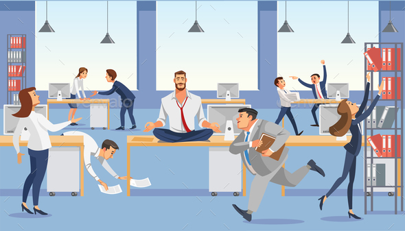
We even have sites using animated illustrations as a way to create a pleasant design for visitors. Vector animation is not only light enough for web use, but also very versatile. There is even a hint of playfulness when you add illustration to a web page.
Broken Grid
The most interesting highlight of web design trends in 2018 is the use of asymmetry. We were so used to the grid system and symmetric layout that the switch to broken grid layouts is a bit surprising. Nevertheless, asymmetrical layouts are great for sites that don’t have an excessive amount of content to display.

Designers have more reign in how the small amount of content is displayed when they can play around with different grid sizes, free placement of web elements, and more. Broken grid layouts also strengthen the uniqueness of a website, creating a distinctive user experience that is refreshing and bold.
More Gradients
Gradients were very big in 2017, and the trend is crossing over to 2018 with more bang and flare. Gradients are vibrant and colourful, big, and attention-grabbing in many sites. We will still see big gradient backgrounds filling the top half of many sites.
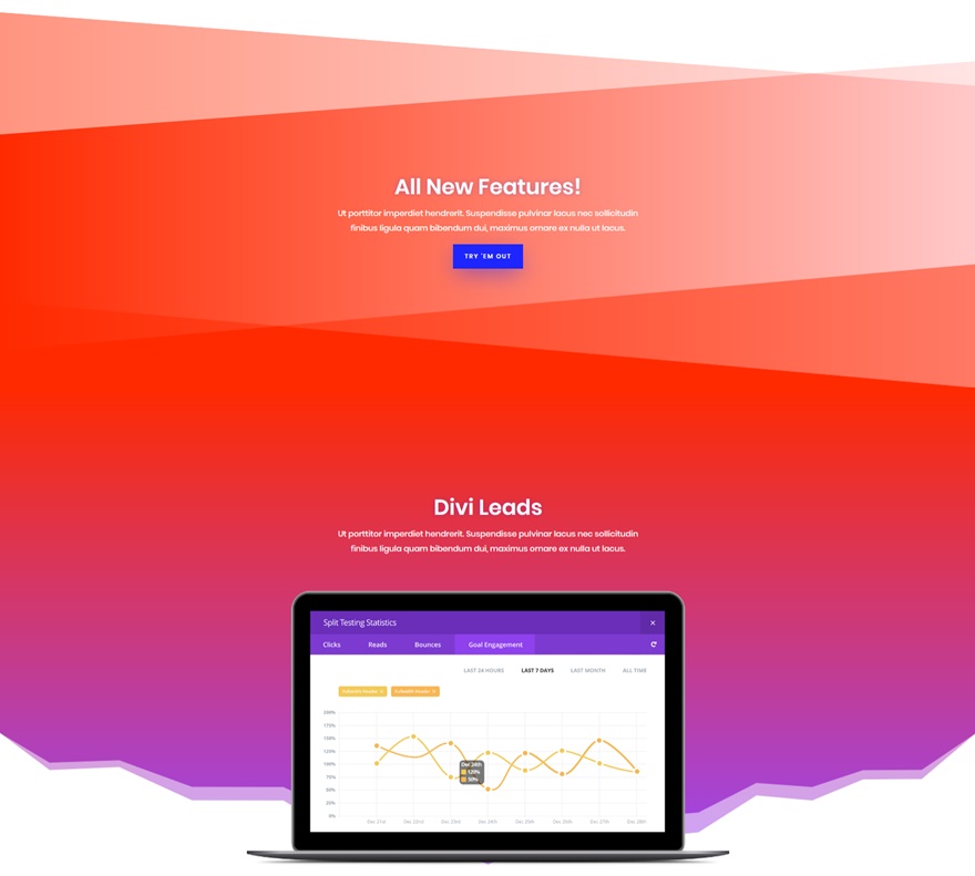
Animated gradients are also becoming more popular, along with the use of gradient filter above photos. The combination can make even the dullest photo background appear chic and interesting, which is perfect for many brands today.
There is no doubt that 2018 will be an exciting year for the web design industry. The bold and vivid new trends we’re seeing today are great signs of more exciting things to come – and incredibly-designed websites – throughout the year.